


Aliria Medicamentos Especiais - 2022
|PT-BR|
Antes de me tornar de tornar designer, atuei por muitos anos como farmacêutico e por isso minha empolgação quando fui procurado para criar uma marca que tem no seu DNA exercer uma assistência farmacêutica centrada no acolhimento e cuidado com o paciente. O objetivo do projeto foi criar uma identidade visual que transmitisse os valores da Aliria de individualização do tratamento e cuidado de uma forma descontraída e moderna, mas sem perder o respeito e a seriedade pela condição de cada paciente.
-
|EN|
Before becoming a designer, I worked for many years as a pharmacist and that's why I was excited when I was approached to create a brand that has pharmaceutical assistance centered on welcoming and caring for the patient in its DNA. The aim of the project was to create a visual identity that conveyed Aliria's values of individualized treatment and care in a casual and modern way, but without losing respect and seriousness for each patient's condition.

|PT-BR|
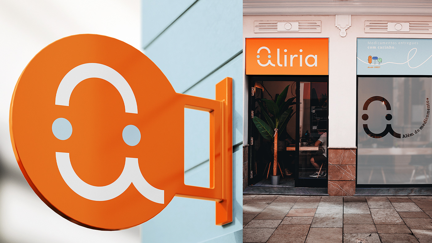
O símbolo foi construído buscando reforçar os principais ideais da empresa. Temos a letra a, de Aliria, além da representação de um sorriso que gera empatia e confiança. Os dois círculos, além de ajudarem a forma um rosto sorridente, simbolizam o diferencial da Aliria que é a entrega e conexão com os pacientes.
-
|EN|
The symbol was constructed seeking to reinforce the main ideals of the company. We have the letter a, from Aliria, in addition to the representation of a smile that generates empathy and confidence. The two circles, in addition to helping to form a smiling face, symbolize Aliria's differential, which is delivery and connection with patients.


|PT-BR|
Escolhemos uma paleta de cores onde colocamos o laranja como cor principal pois é uma cor quente que remete à diversão, sociabilidade e traz um ar moderno para a marca. Os tons leves de azul e verde ajudam a transmitir uma sensação de serenidade, harmonia, calma e confiança.
-
|EN|
We chose a color palette where we put orange as the main color because it is a warm color that refers to fun, sociability and brings a modern look to the brand. Light shades of blue and green help convey a sense of serenity, harmony, calm and confidence.


|PT-BR|
Utilizamos a simbologia das curvas com pontos de partida e final que associado ao sentido de leitura da imagem, conta uma história. O ponto torna-se um elemento estruturante e esclarecedor que indica a entrega e conexão da marca com seu paciente.
-
|EN|
We use the symbology of curves with starting and ending points that, associated with the reading direction of the image, tell a story. The dot becomes a structuring and clarifying element that indicates the overdelivery and connection of the brand with its patient.


|PT-BR|
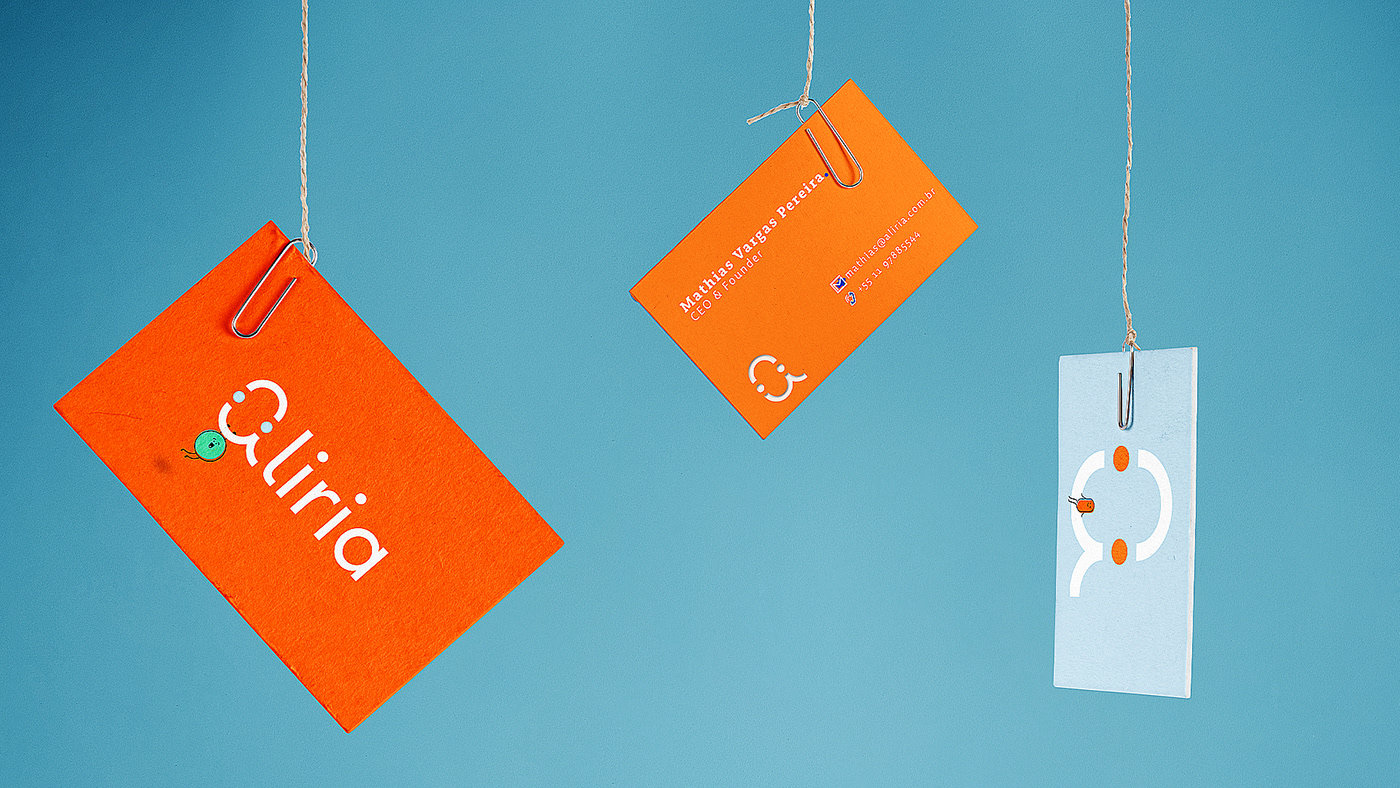
Para transmitir os atributos de diversão e descontração criamos três personagens inspirados nos formatos dos medicamentos e, assim como os ícones, possuem traços simples e orgânicos. Além disso, possuem diferentes expressões faciais para demonstrar suas emoções. As ilustrações têm liberdade para interagir com todos os demais elementos da marca, respeitando sempre o bom senso e o objetivo funcional da mensagem a ser transmitida.
-
|EN|
To communicate fun and casual attributes, we created three characters inspired by the shapes of medicines and, like the icons, they have simple and organic traits. In addition, they have different facial expressions to show their emotions. The illustrations are free to interact with all the other elements of the brand, always respecting common sense and the functional objective of the message to be conveyed.


|PT-BR|
Um dos pontos chaves para o desenvolvimento dessa identidade visual foi a criação das embalagens e apresentações institucionais que serão os principais ponto de contato da marca com pacientes e investidores, portanto, deveria trazer todos os atributos da marca associado a informações relevantes para cada público.
-
|EN|
One of the key points for the development of this visual identity was the creation of packaging and institutional presentations that will be the brand's main point of contact with patients and investors, therefore, it should bring all the attributes of the brand associated with relevant information for each public.


CLIENT: Aliria - Medicamentos Especiais | SERVICE: Strategy and Brand Identity | YEAR: 2022 | CREATIVE DIRECTION: Eduardo Nolasco |
Project Scope: Pesquisa, Estratégia, Identidade Verbal, Identidade Visual, Expressão Visual, Direção de Arte, Manual de Marca, Papelaria Institucional, Simulação
e Aplicação.
Project Scope: Research, Strategy, Verbal Identity, Visual Identity, Visual Expression, Art Direction, Brand Manual, Institutional Stationery, Simulation, and Application.
–––––––
Ohdudi©2022 • All Rights Reserved
Contact me → oeduardonolasco@gmail.com
Follow me → @oh__dudi
Thanks for watching!


